Shortcodes
Shortcodes let you easily reuse a piece of UI or styling consistently. Examples might include a callout or a video embed. Doks supports the use of shortcodes in Markdown files and provides some common shortcodes for you to use.
Learn more about Shortcodes in the Hugo Docs.
Callouts
Callouts (also known as “admonitions” or “asides”) are useful for displaying secondary information alongside a page’s main content.
Callout blocks are indicated using {{< callout >}}{{< /callout >}} to wrap your content, and can be of type note, tip, caution or danger.
{{< callout note >}} This is a note callout. Example text to show it in action. {{< /callout >}}You can nest any other Markdown content types inside a callout, but callouts are best suited to short and concise chunks of content.
Note callout
Note
Doks is a documentation website toolkit built with Thulite. You can get started with this command:
npm create thulite@latest -- --template doks{{< callout context="note" title="Note" icon="outline/info-circle" >}}
Doks is a documentation website toolkit built with Thulite. You can get started with this command:
```bash
npm create thulite@latest -- --template doks
```
{{< /callout >}}Custom callout titles
You can specify a custom title for the callout using the title parameter.
Did you know?
Thulite simplifies developer on boarding time and makes for faster collaboration by using a single declaration manifest for dependencies.
{{< callout context="tip" title="Did you know?" icon="outline/rocket" >}}
Thulite simplifies developer on boarding time and makes for faster collaboration by using a single declaration manifest for [dependencies](https://docs.thulite.io/concepts/dependencies/).
{{< /callout >}}
More callout types
Caution and danger callouts are helpful for drawing a user’s attention to details that may trip them up. If you find yourself using these a lot, it may also be a sign that the thing you are documenting could benefit from being redesigned.
Caution
If you are not sure you want an awesome docs site, think twice before using Doks.
Danger
Your users may be more productive and find your product easier to use thanks to helpful Doks features.
- Clear navigation
- User-configurable color theme
- i18n support
{{< callout context="caution" title="Caution" icon="outline/alert-triangle" >}}
If you are not sure you want an awesome docs site, think twice before using [Doks](https://getdoks.org/).
{{< /callout >}}

{{< callout context="danger" title="Danger" icon="outline/alert-octagon" >}}
Your users may be more productive and find your product easier to use thanks to helpful Doks features.

- Clear navigation
- User-configurable color theme
- [i18n support](/docs/guides/i18n/)
  {{< /callout >}}
Details
You can insert a
details HTML element using the {{< details >}} shortcode.
{{< details "Details" >}}
Something small enough to escape casual notice.
{{< /details >}}
Details
Something small enough to escape casual notice.Start in open state
You can add the open attribute to start details in open state.
{{< details "Start in open state" open >}}
This Boolean attribute indicates whether the details — that is, the contents of the <details> element — are currently visible. The details are shown when this attribute exists, or hidden when this attribute is absent. By default this attribute is absent which means the details are not visible.
{{< /details >}}
Start in open state
This Boolean attribute indicates whether the details — that is, the contents of the<details> element — are currently visible. The details are shown when this attribute exists, or hidden when this attribute is absent. By default this attribute is absent which means the details are not visible.Tabs
You can display a tabbed interface using the {{< tabs >}} and {{< tab >}} shortcodes. The {{< tabs >}} item must have a unique identifier, a descriptive one is recommended. Each {{< tab >}} item must have a label to display to users.
{{< tabs "create-new-site" >}}
{{< tab "npm" >}}

```bash
npm create thulite@latest
```

{{< /tab >}}
{{< tab "pnpm" >}}

```bash
pnpm create thulite@latest
```

{{< /tab >}}
{{< tab "Yarn" >}}

```bash
yarn create thulite
```

{{< /tab >}}
{{< /tabs >}}
The selected tab is remembered in and across pages.
Run the following command in your terminal to start our handy install wizard, create-thulite.
cd into your new project directory to begin using Thulite. Install your dependencies before continuing.
Link cards
Use the {{< link-card >}} shortcode to link prominently to different pages.
A {{< link-card >}} requires a title and an
href attribute. You can optionally include a short description or other link attributes such as target.
Showcase
Explore the infinite possibilities of Doks
{{< link-card
  title="Showcase"
  description="Explore the infinite possibilities of Doks"
  href="/showcase/"
  target="_blank"
>}}{{< link-card title="Showcase" href="/showcase/" >}}Card grid
Group multiple {{< link-card >}} shortcodes in {{< card-grid >}} to display cards side-by-side when there’s enough space.
{{< card-grid >}}
{{< link-card title="Showcase" href="/showcase/" >}}
{{< link-card title="Showcase" href="/showcase/" >}}
{{< /card-grid >}}
Images
Images in Doks use Thulite’ Images integration.
Display an image using the
{{< img >}},
{{< picture >}}, or
{{< figure >}} shortcode.
Page resource
Display a page resource image:
{{< picture src="vincent-van-zalinge-OVCICfR9gXo-unsplash.jpg" alt="A bird flying through a field of tall grass" >}}
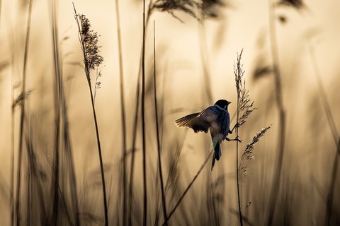
Assets directory
Display an image from the assets directory:
{{< figure
  src="images/vincent-van-zalinge-kK6c4Bkw-unsplash.jpg"
  alt="A small bird sitting on top of a dry grass field"
  caption="A small bird sitting on top of a dry grass field. Photo by Vincent van Zalinge"
>}}
Video
You can insert a
Video Embed HTML element using the {{< video >}} shortcode.
{{< video src="robin_-_21723 (540p)" autoplay="true" muted="true" >}}SVG
SVG’s in Doks use Thulite’ SVG integration.
Display an SVG using the {{< inline-svg >}} shortcode. The SVG gets inlined (embedded) into the pages’ HTML.
Page resource
You can add a monochrome monogram that respects darkmode/lightmode:
{{< inline-svg src="logo-netlify-monogram-monochrome-lightmode.svg" width="64px" height="57px" class="svg-inline-custom svg-monochrome" >}}Assets directory
You can add a logo that respects darkmode/lightmode:
{{< inline-svg src="svgs/logos/logo-netlify-large-fullcolor-lightmode.svg" width="192px" height="79px" class="svg-inline-custom svg-lightmode" >}}
{{< inline-svg src="svgs/logos/logo-netlify-large-fullcolor-darkmode.svg" width="192px" height="79px" class="svg-inline-custom svg-darkmode" >}}
Tabler icons
Copy the icon name from Tabler Icons by clicking on it’s name.
You can add a outline/coffee icon:
{{< inline-svg "outline/coffee" >}}You can specify SVG attributes, for example:
{{< inline-svg src="outline/hand-love-you" stroke-width="1" stroke="#ee52b7" height="3rem" width="3rem" class="svg-inline-custom" >}}